We’re ringing in 2024 with a fresh new look. Evernote's updated user interface includes a beautiful and simplified design, enhanced readability, and a rejuvenated visual identity with a modern color palette and vibrant patterns. The new experience puts your work—not the app—in the spotlight.
You might be wondering why it’s important for us to spend time on a project of this nature when our main priority is to improve Evernote’s speed and reliability. The answer is that it’s not one or the other—both efforts co-exist in harmony, without competing for resources. We’re also mindful that the ultimate touchpoint with our customers is the UI, not the code. So a modern, smooth, and visually satisfying interface is a great complement to the behind-the-scenes work we do, and yet another way to make the entire Evernote experience as great as it can be.
Below, you can see some of the key Evernote screens with the new look. Keep in mind that the final interface—which is currently in beta testing—is still subject to change pending user feedback.
Homepage
Before
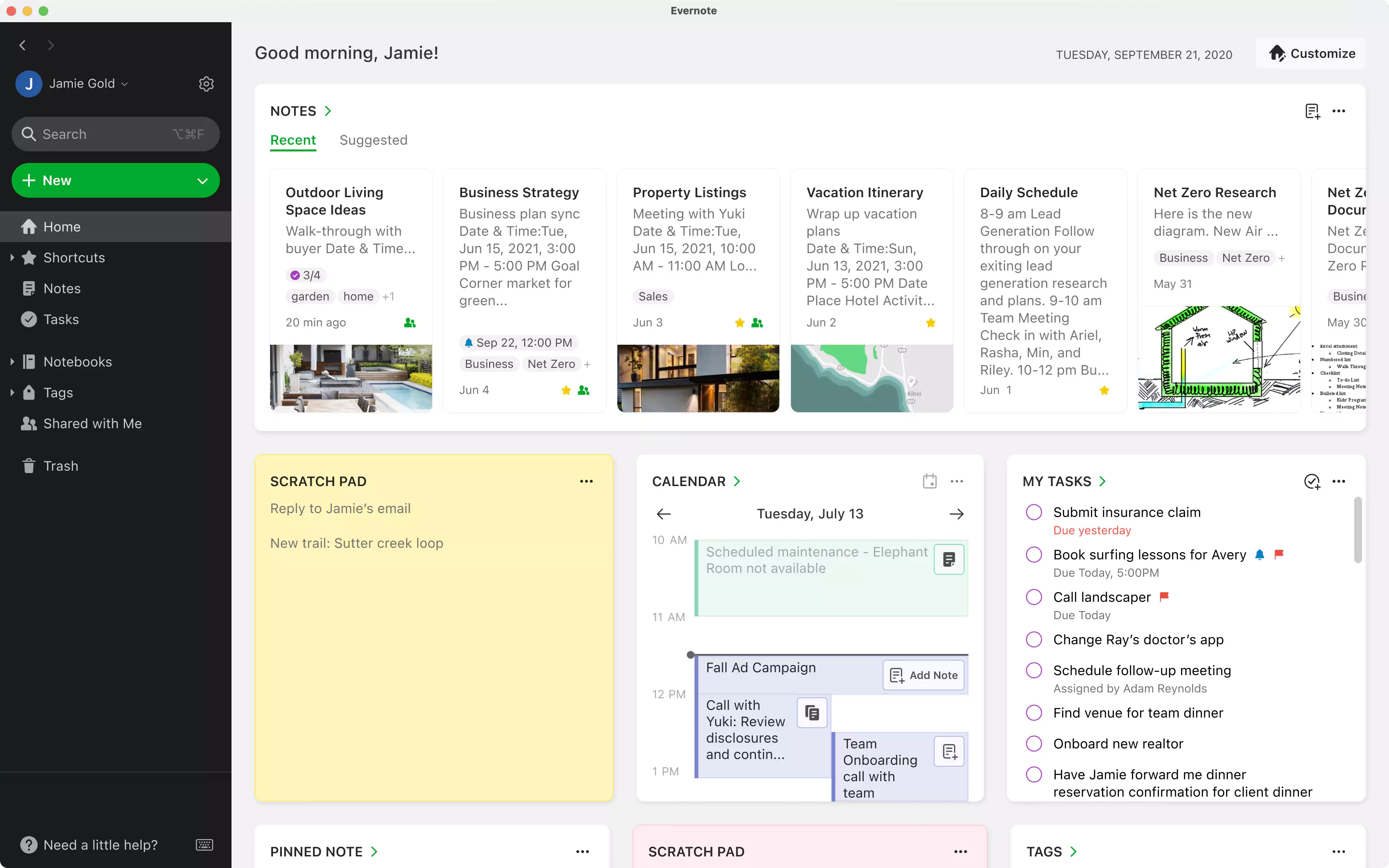
After
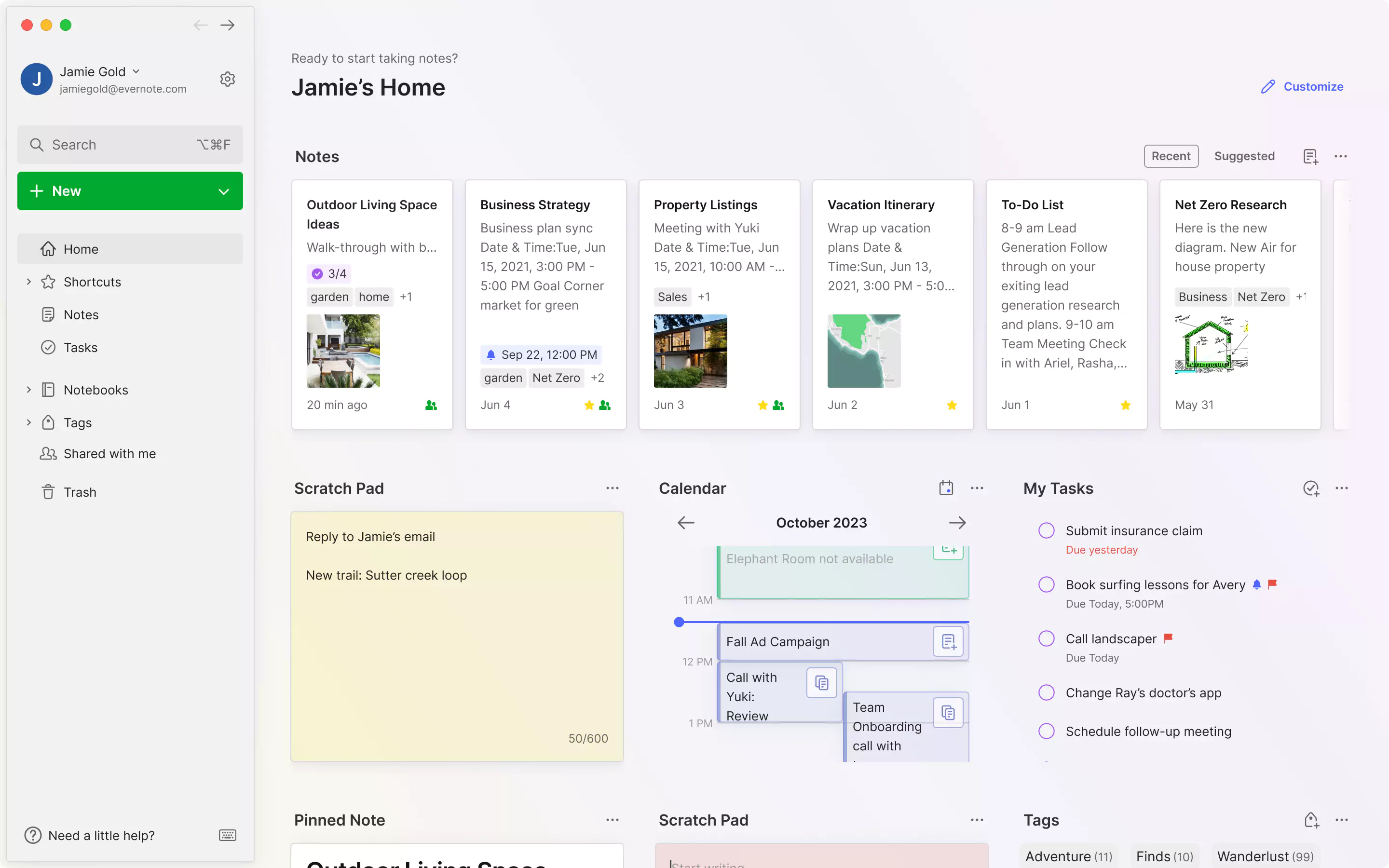
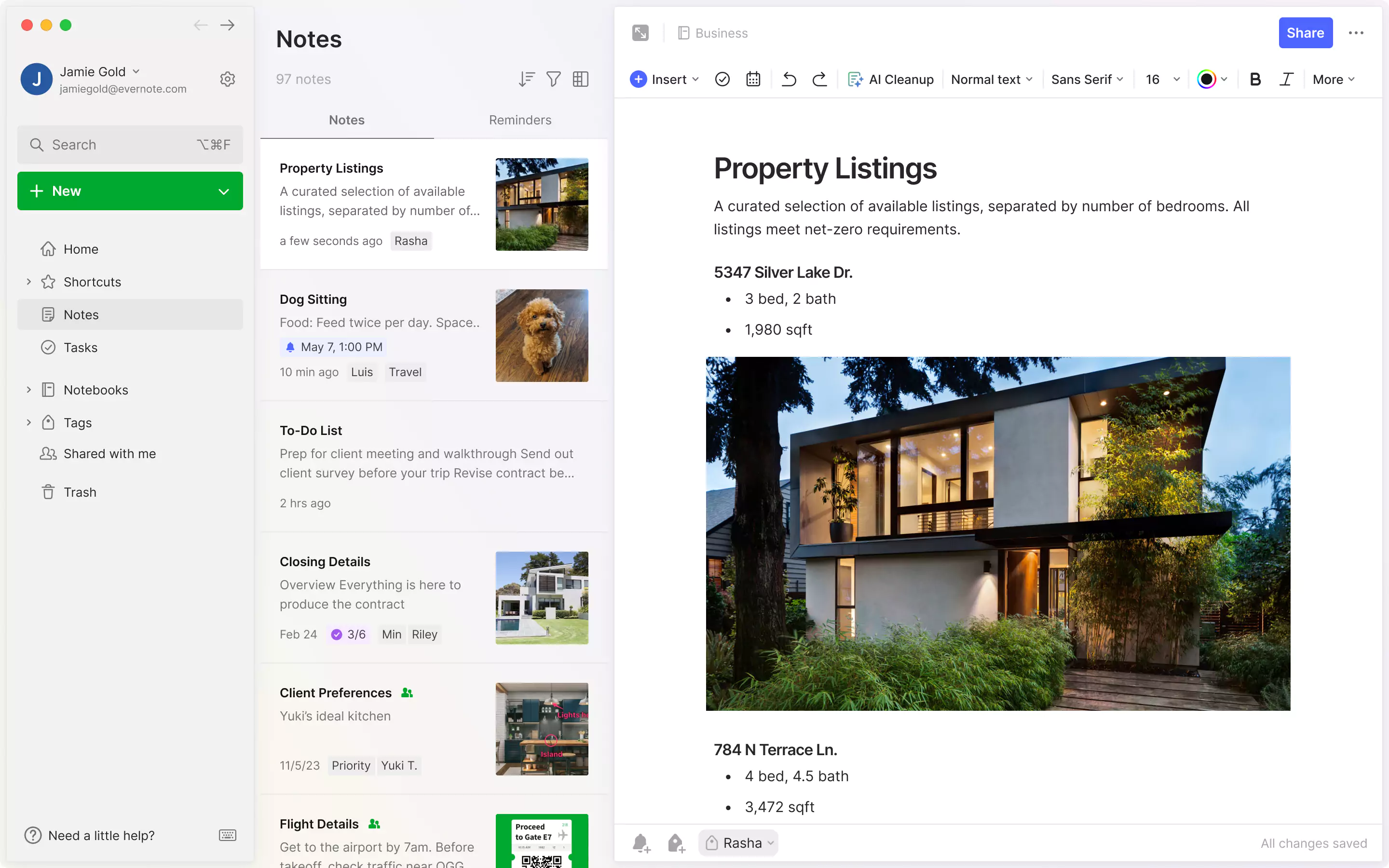
Notes list & editor
Before
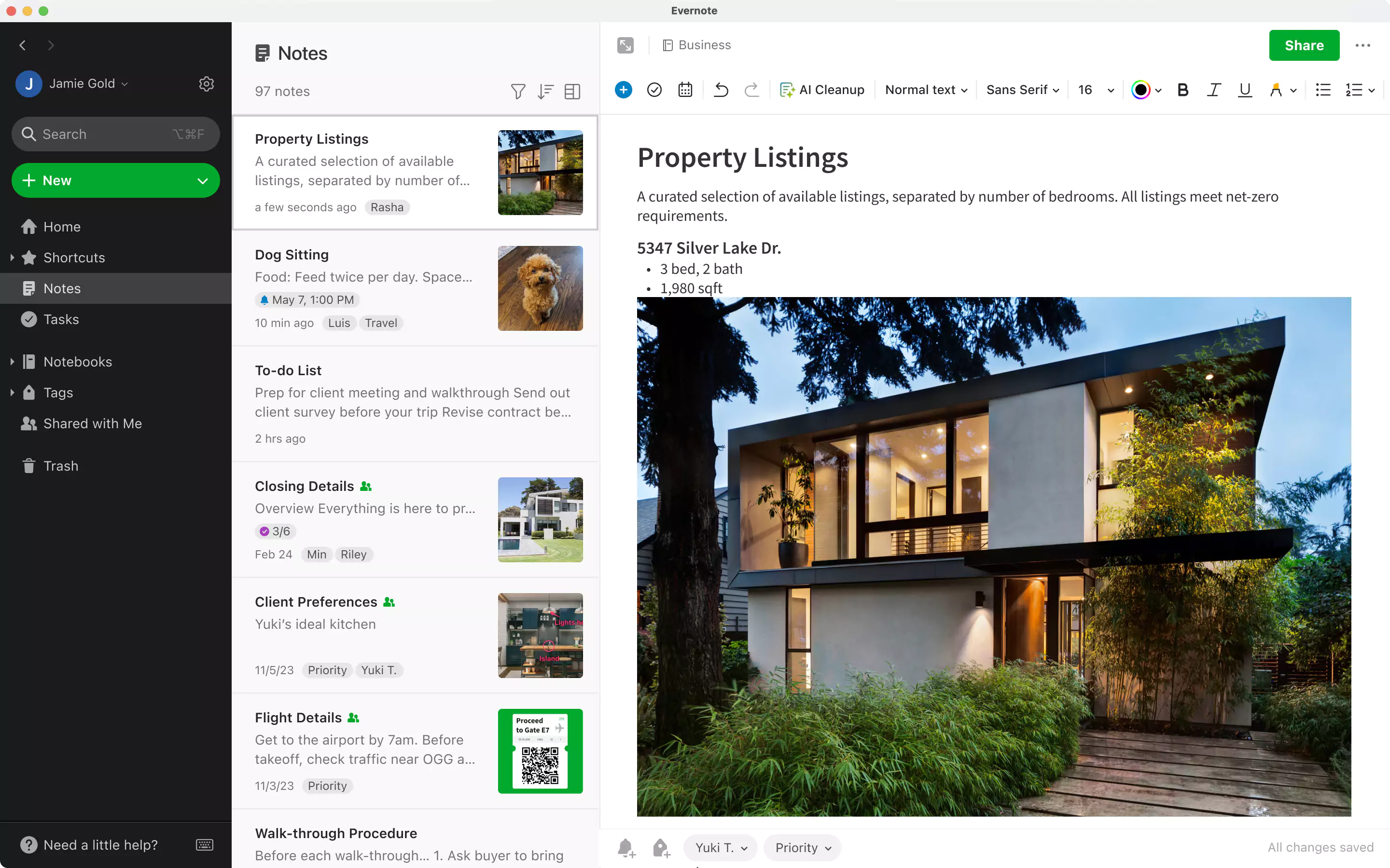
After
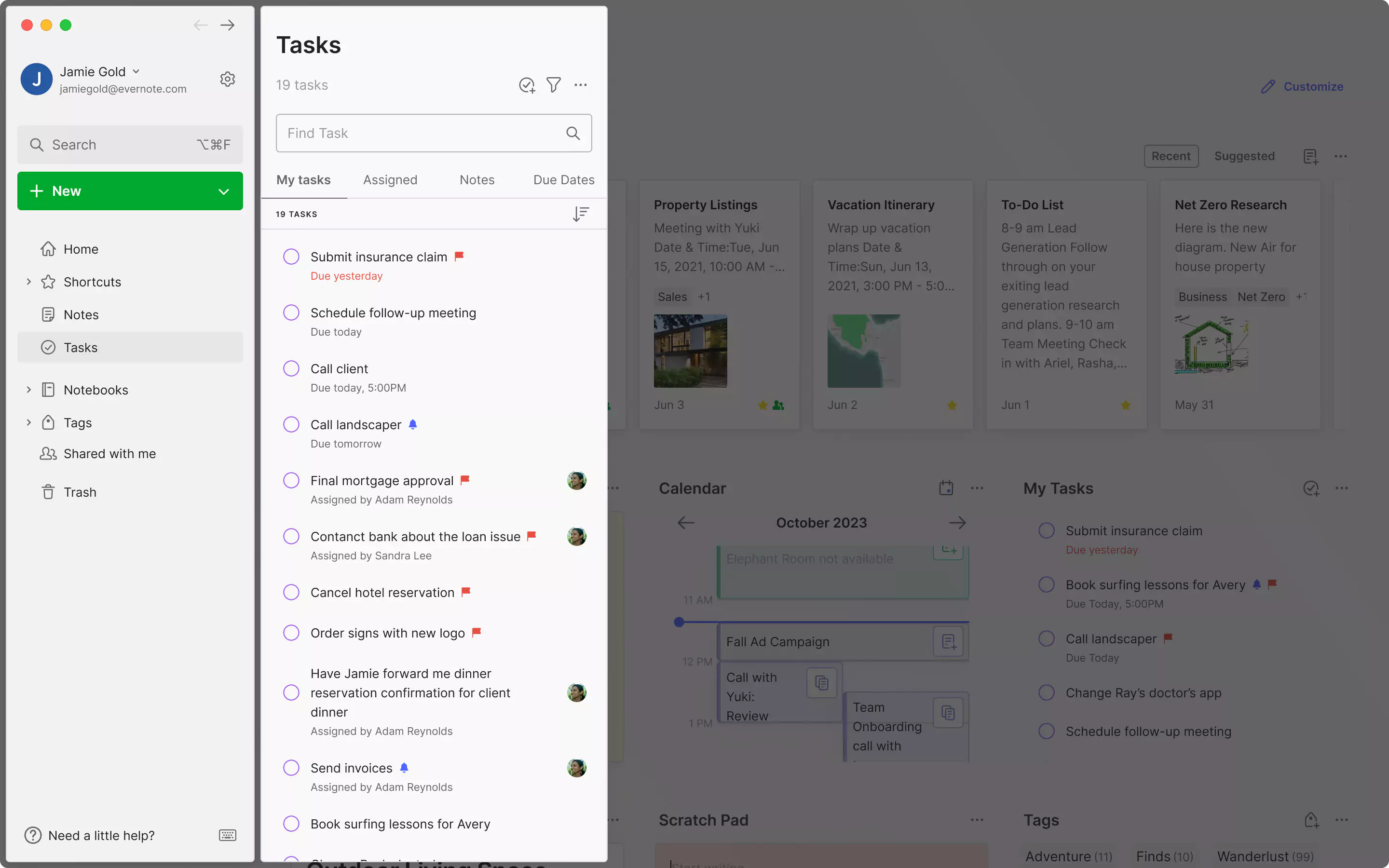
Tasks
Before
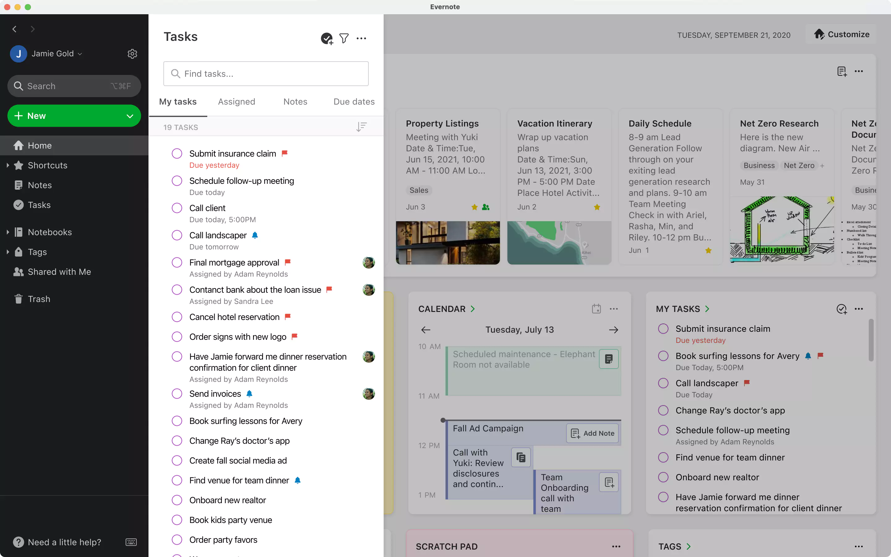
After
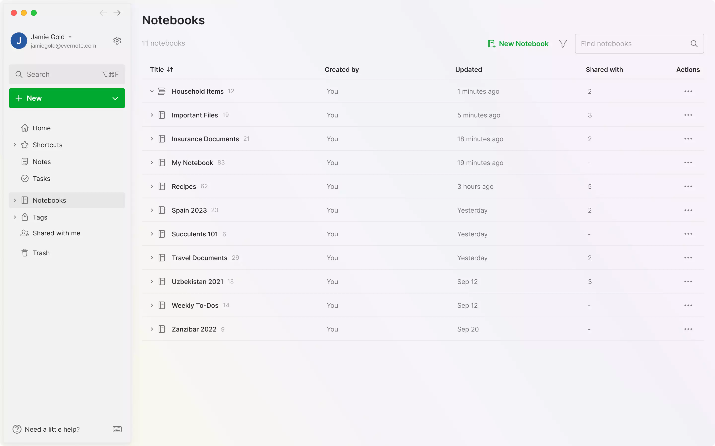
Notebooks list
Before
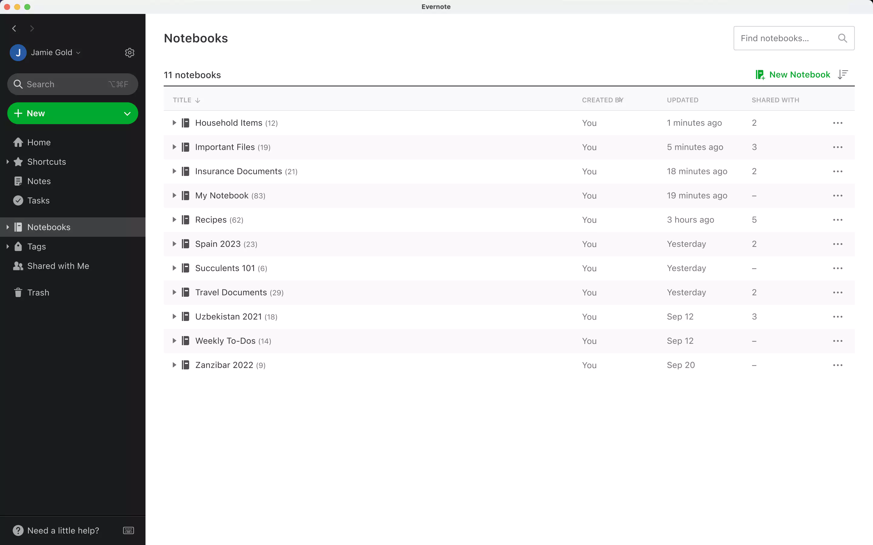
After
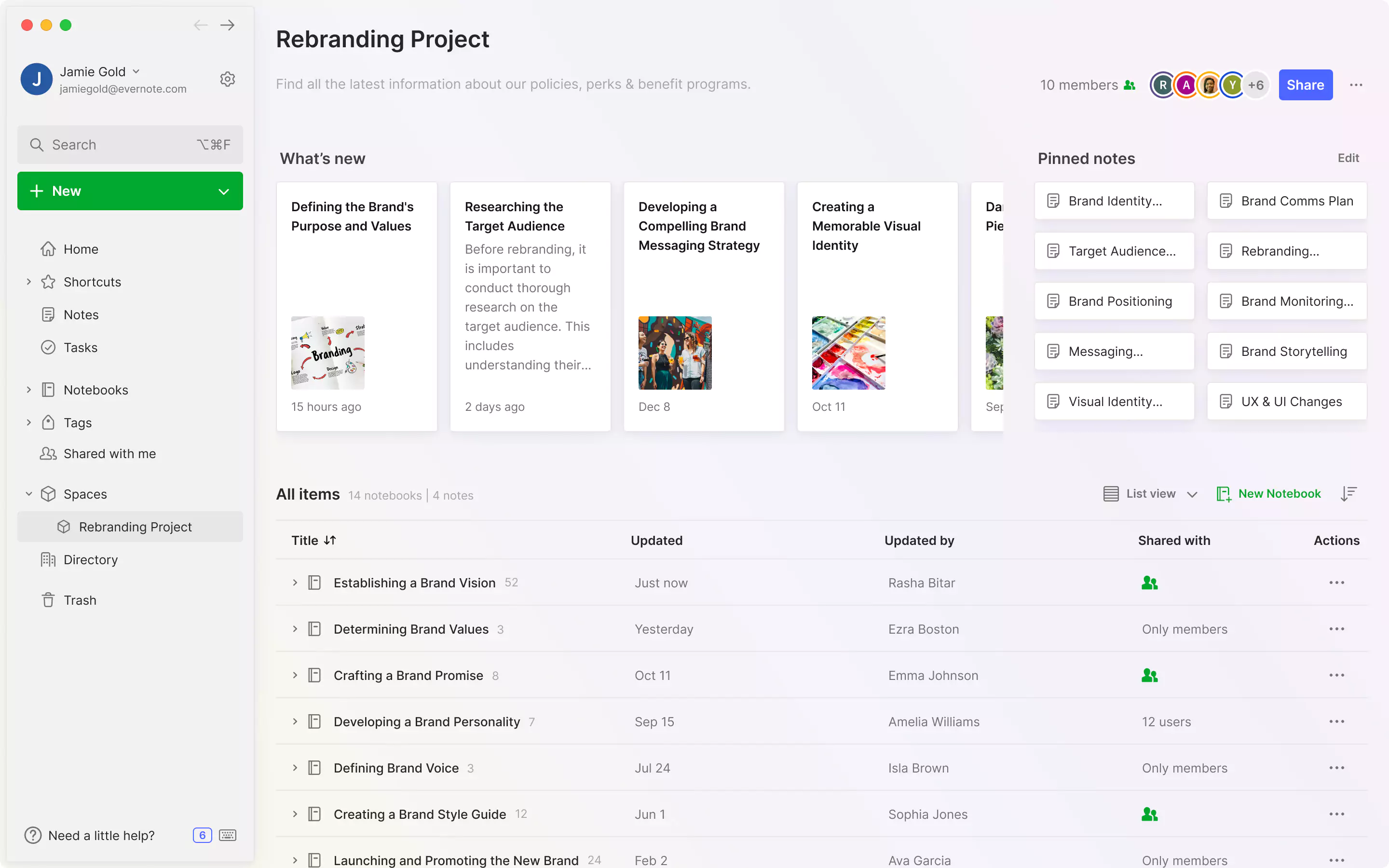
Spaces (Teams)
Before
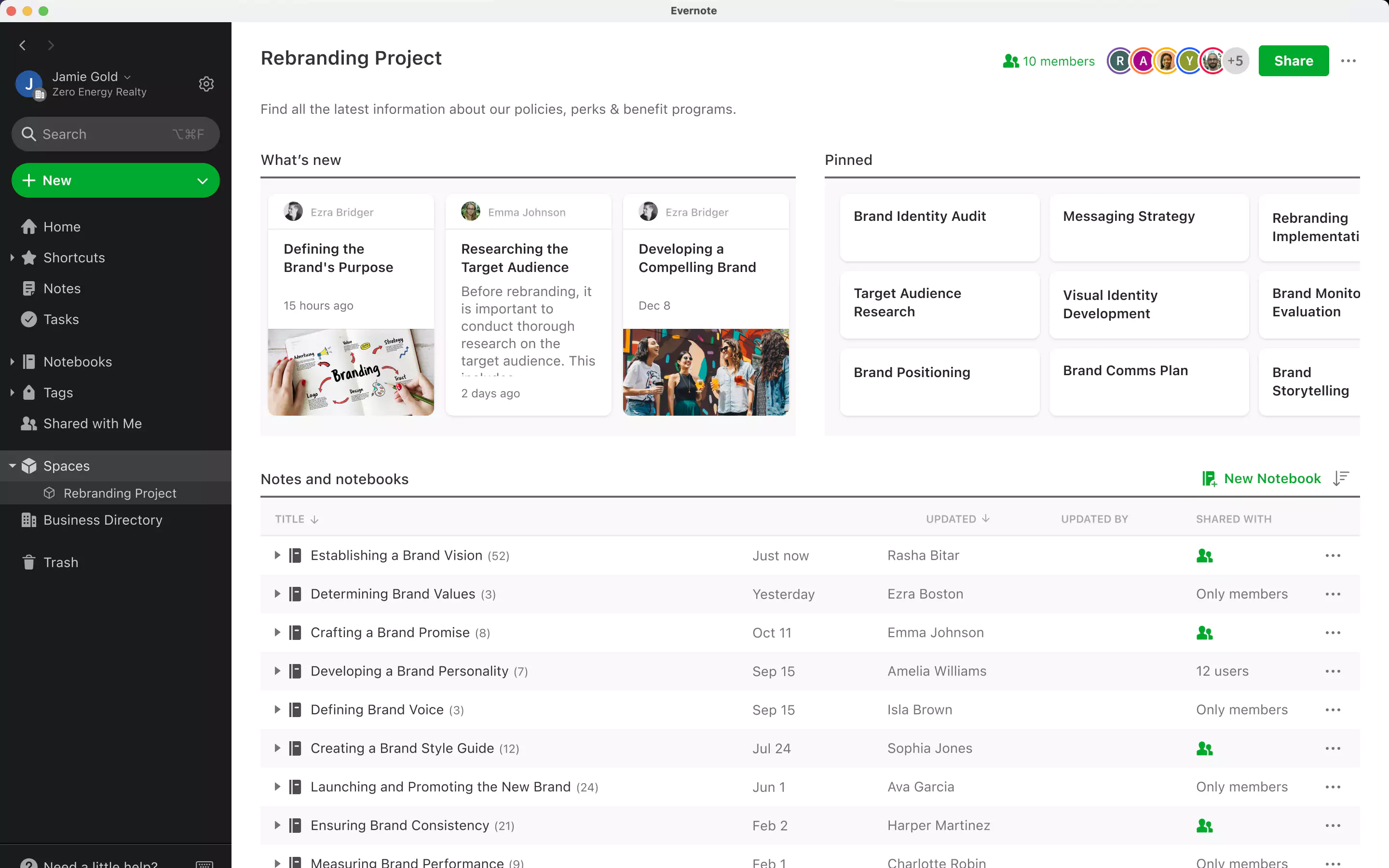
After
From the outset of the project, our intention has been to provide a wonderful experience without disrupting the habits, flows, and patterns that Evernote users rely on to accomplish their goals quickly. With this in mind, Evernote’s new design revolves around four key principles:
1. Respecting existing workflows. Instead of rearranging buttons or features, we introduced subtle UI adjustments to enhance the user experience without disrupting familiar workflows.
2. Enhancing focus. In the past, visually intrusive elements like a dark sidebar inadvertently drew attention away from the content you were working on. With the essential, unified design of the new interface, you’ll still have immediate access to all the tools you need, while staying focused on the only thing that matters: your work.
3. Infusing modernity. The cohesive design mirrors the many below-surface improvements we’ve made to Evernote over the past year, so the experience feels as precise and fluid as the technology that powers it. Plus, as the new interface is at the forefront of contemporary industry standards, Evernote will fit in seamlessly with your other productivity tools.
4. Facilitating future iteration. The updated interface adopts a simpler, more manageable design system. In the future, this will ensure that Evernote’s design remains agile and responsive as we improve existing features and introduce new ones.
Above all, we wanted to make sure you’d still find everything you know and love about Evernote, but repackaged in a lighter, optimized interface. A great example of the subtle, strategic changes we implemented is the new Evernote typeface. The new default font—Inter—significantly improves note readability without compromising information density, as it’s more readable than the previous default—Sans Serif Pro—while occupying almost the exact same amount of pixel space.

Can’t wait to try the updated experience for yourself? We’re rolling out the design on Evernote Desktop and Web starting on January 15—sign up here for early access (all you need is the email address for your Evernote account).
Plus, the Evernote website got a refresh

In addition to all the exciting changes coming to Evernote Desktop, we also launched a brand new look on Evernote.com. The new website will greet visitors with a warm, vibrant welcome, adding an element of fun and creativity to the online experience through new branded elements, such as bold icons and whimsical illustrations.

What do you think about Evernote’s new look? Share your thoughts in the Evernote user forum, or tag us on social media (@evernote on all platforms)!
