-
-
Notifications
You must be signed in to change notification settings - Fork 62
New issue
Have a question about this project? Sign up for a free GitHub account to open an issue and contact its maintainers and the community.
By clicking “Sign up for GitHub”, you agree to our terms of service and privacy statement. We’ll occasionally send you account related emails.
Already on GitHub? Sign in to your account
[Request] Make the compose button more prominent #191
Comments
|
Thanks for the suggestion! I'd say this doesn't really fit the GNOME HIG (maybe under overlaid controls(?)) and such pattern is not found in any other GNOME app so it probably won't happen. It mostly fits Material Design's "floating action buttons". At the same time, it makes sense for the compose button to be more prominent for a microblogging client. I'll rename the issue a bit to be more generic and add the design tag. Things to consider:
|
|
Not a designer, just a user interested in UX, but a temporary band-aid solution would be to add the suggested action style to the compose button. Ideally it would be moved to within the timeline view too, but with that view switcher there it would definitely be too complicated. |
|
It's included in the new design mockups: #228 (comment) (this issue will stay open until implemented) |


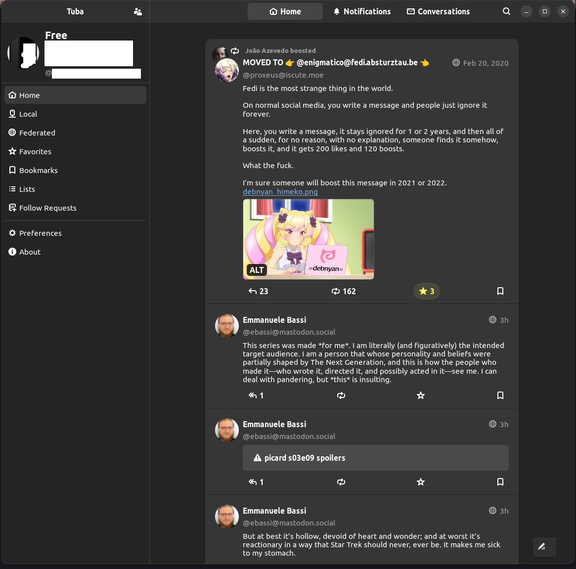
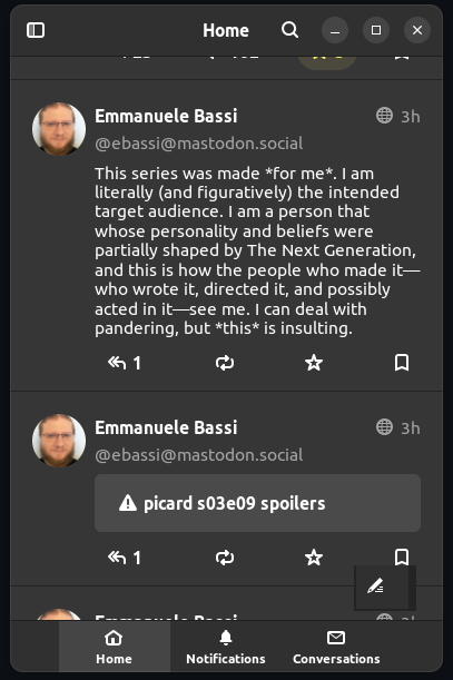
Environment: Ubuntu 22.10 Wayland, Desktop on Big Screen, Flatpak Tuba v0.2.0 install.
The upper left button should be re-designed as an edit button to perform your own profile edits, such as changing the picture, the name etc. While the posting button should be more prominently displayed in bottom right as overlaid maybe, transparent, or in some other fashion.
Use Case: will encourage more user engagement and posting by reminding folks this is not a consumption only but posting platform.
Example in Expanded Mode:


Example in Compact Mode:
The text was updated successfully, but these errors were encountered: